iOS 7.1
New minimal UI mode and old bugs on Safari
About 6 min reading time
As you might know, iOS 7.0 included one of the buggiest browsers of all time for iPhones and iPads. After 5 months we have now the 7.1 update that wants to give some fresh air to web developers. Let’s see if Apple succeeded on the task.
Problems on 7.0.x #
You can see my old post on iOS 7 bugs for details, but we can summarize problems in:
- Full-screen navigation
- Bottom toolbars requires double tap when in fullscreen mode
- No way to detect when toolbar appears/disappears
- Web SQL for databases >5Mb not working
- Home Screen Webapp issues, including: Application Cache, icons, multitasking, status bar color
Some other issues for Home Screen Webapps were already solved in 7.0.3 update a month after the initial launch, such as the ability to open external URLs and the usage of standard dialogs, such as alert.
Apple has patched 19 bugs in the Web Core (for Safari, WebView and Home Screen webapps) since 7.0.3 but it’s not clear which ones. There are some reports on some fixes on requestAnimationFrame and Web Workers.
New stuff #
The browser in 7.1 is the same as in 7.0 in terms of APIs and abilities, so no new features to cover.
New minimal-ui viewport declaration #
Don’t expect any update on the documentation on this (is anyone expecting an update in the outdated Safari docs anyway?), but the viewport meta tag now supports a new boolean property for iPhone and iPod touch: minimal-ui. And this is the biggest change in 7.1 for web developers.
<meta name="viewport" content="width=device-width, minimal-ui">The presence of minimal-ui in the viewport will trigger a full-screen mode automatically that will be well-received by webapps and UI frameworks (such as Sencha Touch or jQuery Mobile).
This mode looks different based on orientation: it includes the iOS status bar and a small title bar on portrait and nothing on landscape (immersive mode). No URL bar or toolbar will appear on both orientations. That means there is no visible back button, besides the back gesture that is still available.
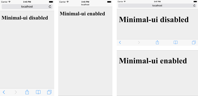
The hidden toolbars will appear as modal windows only after a tap on the top portion of the screen (compared to top or bottom on mormal mode).
It seems there is no way to set/unset the minimal UI dynamically from code unfortunately. I’m wondering why Apple didn’t go with the FullScreen Javascript API.
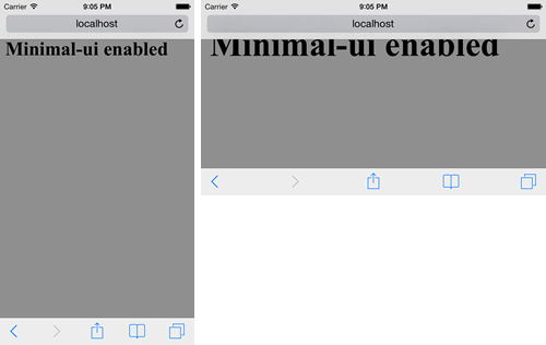
When in landscape there is no status bar or title bar, but the toolbars will appear when tapping on the top portion of your document. That also means that the first 40 physical pixels of the page should not be used for clickable elements on that orientation; that is 10 CSS pixels if you are using a width=device-width viewport or 20 CSS pixels on width=device-height (useful on portrait). You can draw there but no interaction is allowed; that means that we should not use something as a small select picker on the top as in the following example because it will just trigger the toolbars.

Some important things about the minimal UI feature:
- No minimum document’s height need for getting the full-screen mode (compared to the old window.scrollTo trick).
- Adding or removing the minimal-ui after onload have no effect, so no way to define or change it dynamically
- No resize events will fire on show/hide
- On landscape, you are in immersive mode; even the iOS status bar is hidden; however, the first 40 physical pixels are available for your document’s canvas but not for interaction
- If you link two URLs with minimal UI, Safari will wait for the second page to load before showing the toolbars. Therefore, the process is seamless and it will be a minimal UI experience between all your linked HTMLs avoiding UI glitches.
Compatibility #
A quick test says that adding minimal-ui is safe enough on the modern mobile web and different browsers, including Safari on iOS 6.x/7.0, Android Browser, Firefox, Google Chrome and IE will just ignore the declaration and set up a proper viewport anyway based on the other attributes. Chrome can trigger a warning on console that the value is not valid, but the rest of the declaration will be used.
Please, think twice before adding minimal-ui #
While a full screen mode sounds good, it’s not the best solution for every kind of website or webapp.
Don’t use minimal-ui as the new default viewport value; use it with responsability.
Think about usability: the user will not have the back, the share and the tabs buttons available by default. If you are creating an inmersive game or a webapp with the main navigation controls then minimal-ui is a good idea; for content- and document-based websites, it might not be nice for the user.
If you are creating a webapp using a UI framework such as jQuery Mobile or Sencha Touch, using minimal-ui is a very good idea. UI glitches on iOS 7 on these frameworks’ animations were a big problem, basically when changing the browser’s history.
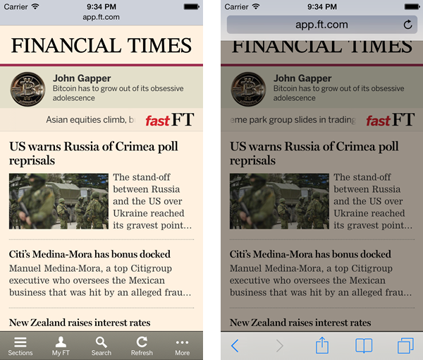
This mode is also particularly useful if you have a bottom toolbar (as Financial Times Webapp); in normal mode after scroll it will requiere two taps (check my previous post for more info)
The Financial Times webapp is already using the minimal UI mode; the only main difference here with previous operation is that the “Add to the Home Screen” button is no longer for easy access. Therefore future invitation bubbles should explain that you need to activate toolbars first (such as “Click at the top on the title, now click on Share, now Add to Home Screen).
Minimal-ui vs. full-screen after scroll #
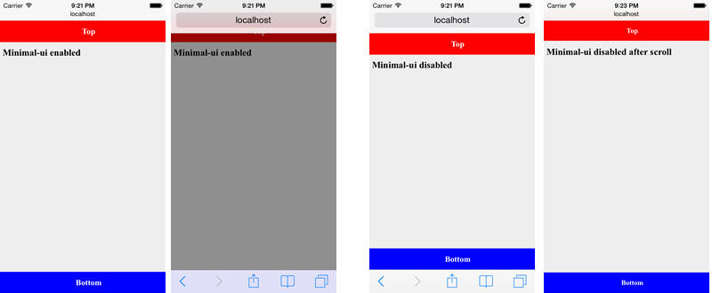
If you have a content that scrolls vertically the toolbars will also hide after the user scrolls down without a minimal ui declaration. However, they will come back after scrolling up and the main difference is that in this case, the canvas’ size will change. When using minimal-ui, the canvas size will always be the same and toolbars will appear as modal over it. In normal mode document’s size will change based on current toolbar status.
In the next example we can see what happens with fixed positioned elements on each situation.
Detecting minimal-ui mode using media queries #
We can use media queries (specifically for iOS devices today) to detect if we are on minimal-ui mode or not (with a width=device-width viewport), using:
@media (device-height: 568px) and (height: 529px),
(device-height: 480px) and (height: 441px) {
  /* minimal-ui is active */
}
@media (device-height: 568px) and (height: 460px),
(device-height: 480px) and (height: 372px) {
/* normal mode, minimal-ui inactive */
}I’m not saying this is a good idea, but for now it’s the only trick if we really need it.
Minimal-ui for iPad #
The minimal-ui declaration is ignored by iPads, as there is no way to trigger a full-screen experience from Safari itself. We only have the old option of a home screen app.
Web SQL Bug #
The Web SQL bug was finally solved and the API is already fully compatible again from 7.1.
Home screen webapp bugs #
Here we have a match in terms of bugs solved and bugs still there. Unfortunately, a match means problems for us. Home screen webapps are still buggy in many ways, mostly regarding multitasking, opening several webapps at the same time and returning to previous webapp sessions or something seeing the current webapp as a background for the multitask view instead of the typical background (next image).
Compared with iOS 7.0 now AppCache is working again up to 25Mb for home screen webapps (while 50Mb can be reached with a user’s permission while in Safari).
After going forward and backward between webapps I’ve seen many times a “black effect” or a “white effect” that is, the webapp tries to reload after waking up and it doesn’t work leading to just a white screen or a black screen. The only way to get out of it is to close the webapp and try again.
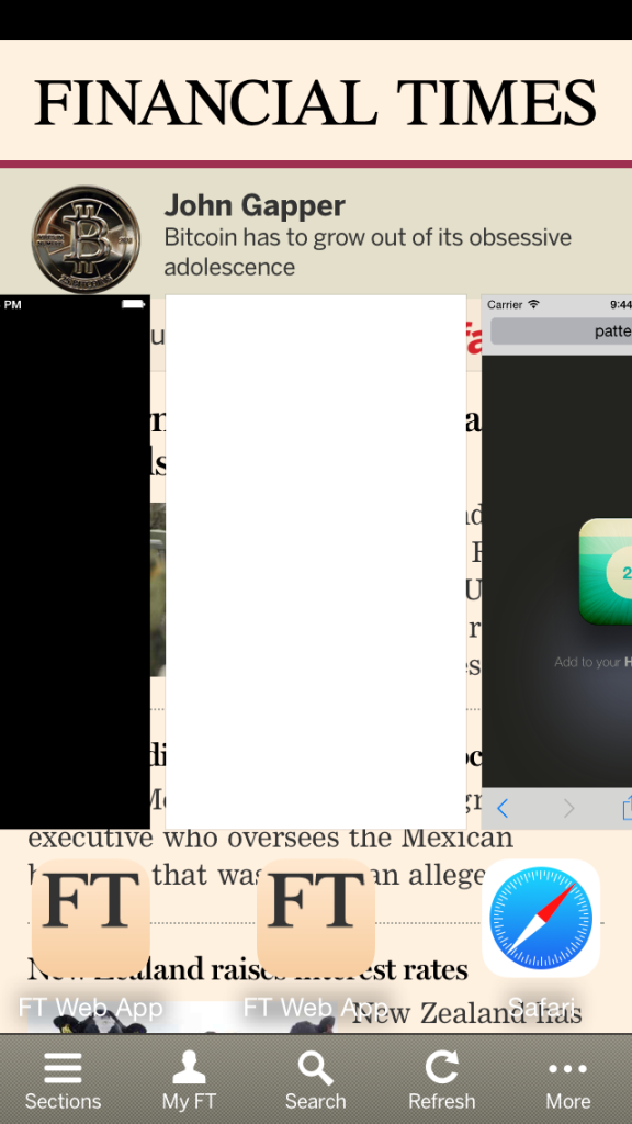
The status bar by default is still black over black and we must use a meta tag to change it. Also as a problem without solution, the preview for a “minimized” webapp on the application history list is still just a white rectangle instead of the launch image or a screenshot of the last canvas.
Home screen webapps or minimal UI webapps? #
Now that we have the minimal UI ability, and with all the bugs on Home Screen webapps, we should ask how useful or different home screen webapps are.
The main differences in favor of Home Screen webapps are:
- Isolated storage and cache from Safari
- Looks like a native app in the multitasking panel (App History) – with bugs.
- Unlimited Web SQL storage
- Isolated UI: users don’t see any URL bar, toolbar or tabs.
The main differences in favor or Minimal UI webapps are:
- No need for a Home Screen icon
- It can be loaded from a URL, bookmark or a Home Screen icon
- On landscape, it is immersive mode (on a Home Screen webapp, you still have the OS’ status bar)

 by Maximiliano Firtman